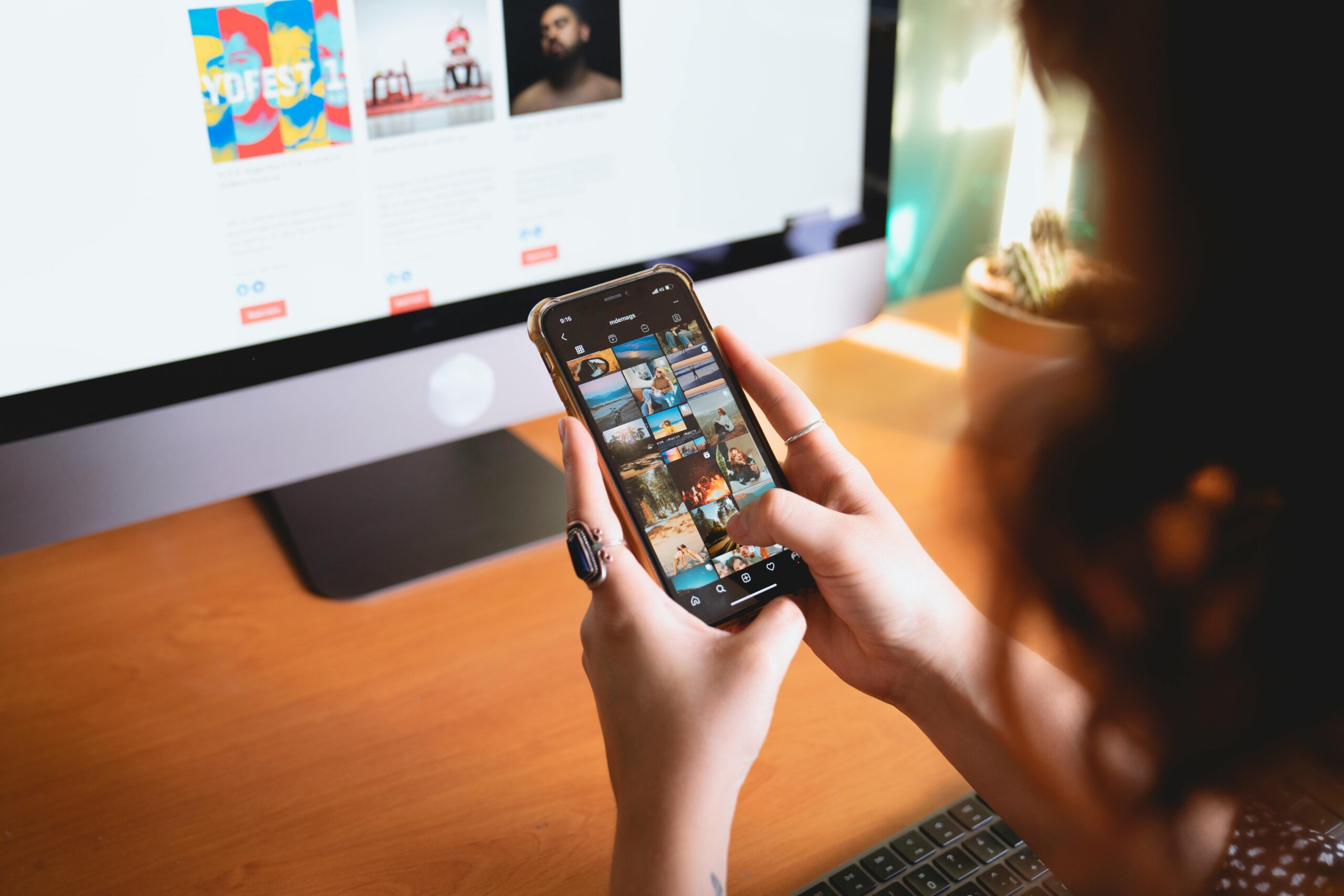
You’ve spent hours perfecting your merch design, the logo, the message, the mood. But once it’s uploaded, it’s competing in a digital ocean of visuals. In that split second of scrolling, what makes someone stop and click yours?
Here’s the secret: algorithms don’t just reward engagement, they’re tuned to what grabs the human eye. And in the online world, that’s almost always colour and contrast.
Your palette isn’t just an aesthetic choice; it’s an algorithmic signal.
1. The psychology of colour
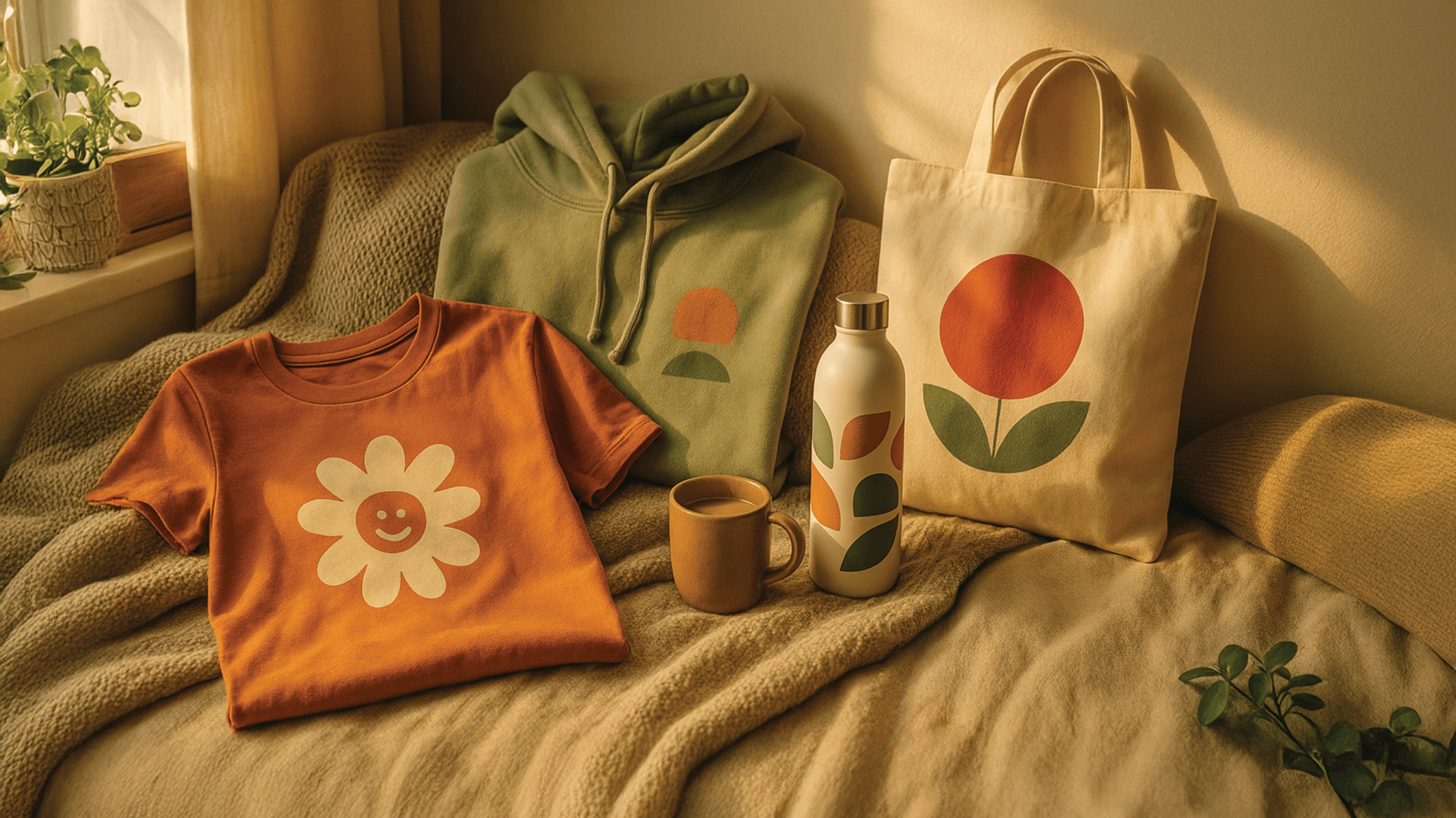
Colour has always been emotional. But online, it’s also strategic. Studies show colour increases brand recognition by up to 80%, and influences buying decisions within 90 seconds of exposure.
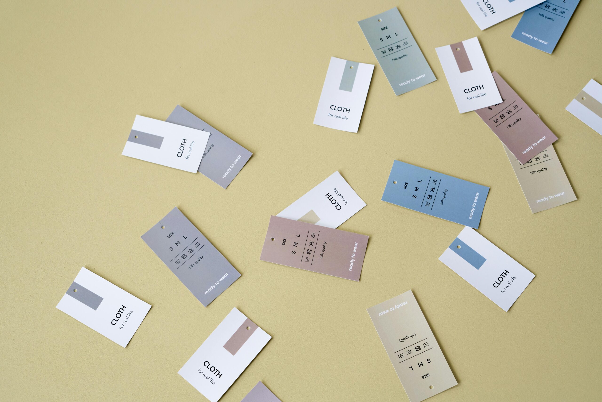
Each hue carries psychological cues:
-
Warm tones (reds, oranges, yellows) trigger energy, urgency, and excitement – ideal for limited drops or calls to action.
-
Cool tones (blues, greens) communicate calm, trust, and reliability – perfect for lifestyle or wellness-led merch.
-
Neutrals and earth tones evoke minimalism, sustainability, and timelessness – aligning with eco-conscious or design-savvy buyers.
When used intentionally, colour tells your brand’s story before your caption ever does.
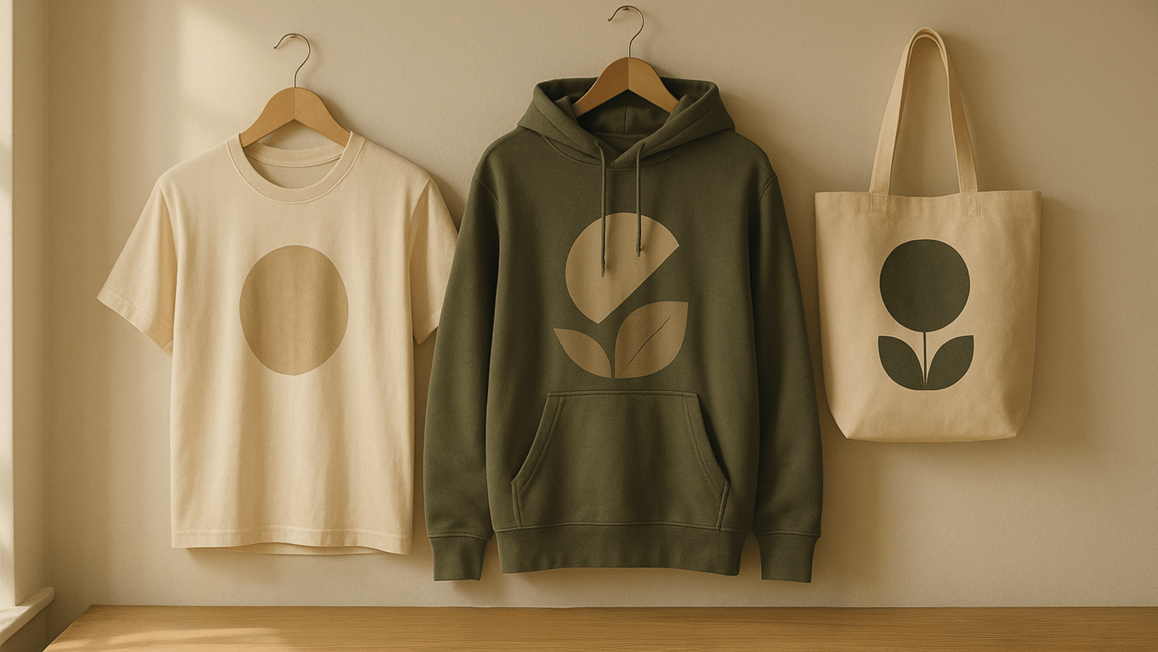
2. Contrast
Think of contrast as visual hierarchy: what the eye sees first, next, and last.
High contrast (light on dark or dark on light) instantly attracts attention, especially in crowded feeds. It’s why a white hoodie pops against a vibrant background, or why a bright product photo cuts through a muted scroll.
But balance matters. Too much contrast can feel chaotic, while too little makes your image fade into the feed. The sweet spot? Enough distinction to draw the eye, with consistency that keeps your brand recognisable.
Pro tip: Test your product images in both light and dark mode. If it stands out in both, you’ve nailed your contrast balance.
3. Algorithms love clarity
Social algorithms don’t “see” your product like a human does, they detect shapes, tones, and brightness levels. Clean contrast and simple backgrounds help your merch stand out in thumbnails and previews, increasing click-through rates.
Complex backdrops or overly muted tones can confuse both the viewer and the platform’s visual recognition models, lowering visibility.
So when designing your visuals, think:
-
Can someone instantly tell what’s being sold?
-
Does the product’s outline pop against its background?
-
Would the image still make sense at 1/10th the size?
Because in a world of tiny screens, clarity converts.
4. Colour trends that boost engagement
Every platform has its own visual rhythm. Successful creators adapt their palettes accordingly:
-
Instagram favours warm, cinematic hues and natural textures.
-
TikTok rewards bold contrast, bright colours, and dynamic lighting.
-
Pinterest leans toward soft tones and cohesive palettes that inspire calm discovery.
Experiment within your brand identity, not beyond it. The goal isn’t to chase every trend, but to find the version of your colour story that aligns with where your audience spends time.
5. How to build your brand’s visual signature
Consistency builds trust, and algorithms notice it too. Create a recognisable visual rhythm across your posts:
-
Use 2–3 signature colours across products and imagery.
-
Keep background tones cohesive.
-
Add subtle repetition, the same lighting, wall texture, or environment, so every post feels unmistakably yours.
Over time, this consistency tells both people and platforms, “This is a brand worth remembering.”
6. Test, learn, and adapt
Designing for the algorithm isn’t about manipulation; it’s about understanding how humans respond to visuals.
Try posting the same product shot with two different background tones. Watch which one drives more engagement, saves, or clicks. Those micro insights become your creative data.
Every scroll, pause, or double-tap is feedback, your visual analytics in motion.
Final thoughts: Colour is connection
At its core, good merch design is about resonance.
The algorithm amplifies what humans respond to, and humans respond to colour that feels alive.
When you design with psychology and contrast in mind, you’re not just optimising for clicks, you’re crafting an instant, emotional connection.
Because when someone stops scrolling, even for three seconds, that moment of attention is your new storefront.
And colour is your open door.