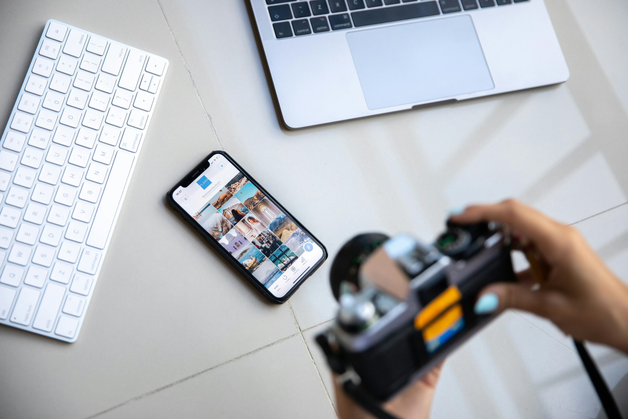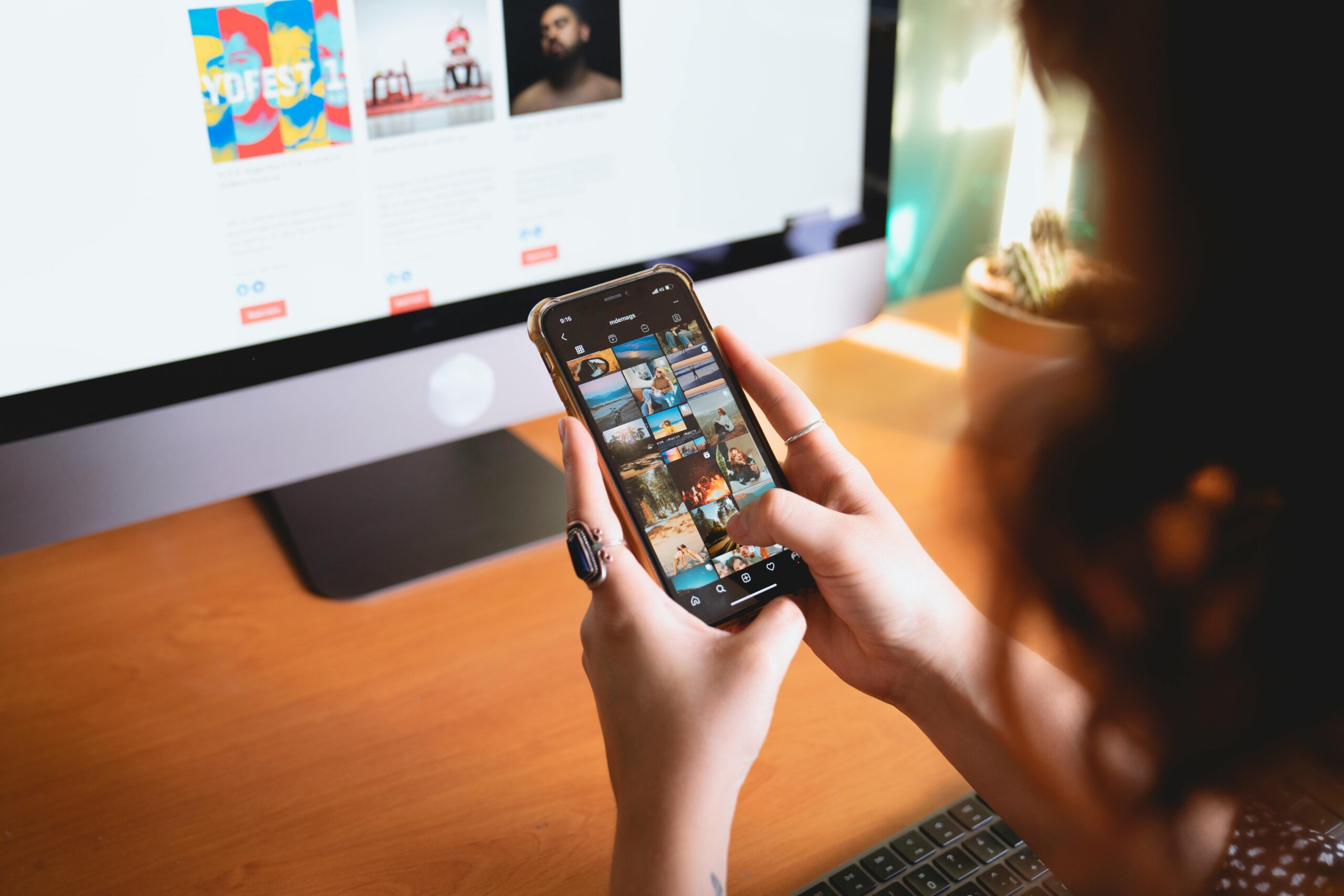
Most customers never see your merch at full size before they click.
They see a tiny square in a search result, a cropped preview on Instagram, a fast-moving tile on TikTok Shop, or a thumbnail buried in a creator’s grid.
In these micro-moments, people make near-instant decisions.
Scroll or stop. Click or ignore.
Your visuals have a fraction of a second to make an impact.
Designing for the thumbnail era isn’t optional.
It’s the new foundation of merch marketing.
Why thumbnails matter more than you think
The modern online shopper doesn’t browse the way they used to. Algorithmic feeds and mobile-first platforms create a world where:
-
Most product images are viewed at 1/5 of their original size
-
First impressions happen before a user consciously notices your design
-
Brightness, clarity, and contrast matter more than detail
Thumbnails act as your brand’s billboard in miniature. If your merch doesn’t pop at that size, you lose potential customers long before they even see your work.
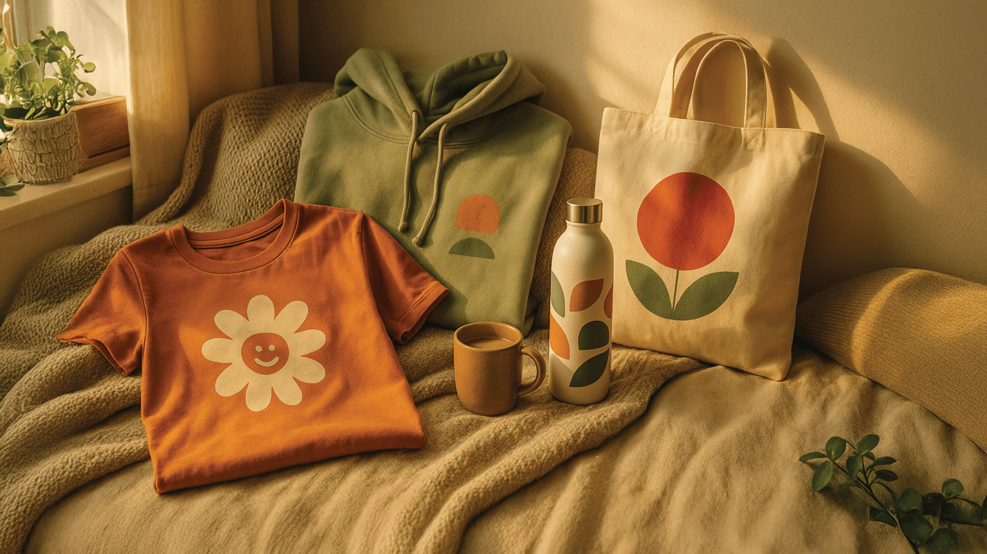
1. Prioritise clarity over complexity
Detailed artwork often disappears in thumbnail view. Delicate lines, intricate shading, or fine text become visual noise.
Instead, focus on:
-
Clear shapes
-
Bold silhouettes
-
Strong contrast
-
Recognisable motifs
If someone can’t understand what your product is within half a second, the design needs simplification for that specific context.
The test: Shrink your image to 100×100 pixels.
If it still makes sense, you’re ready for the feed.
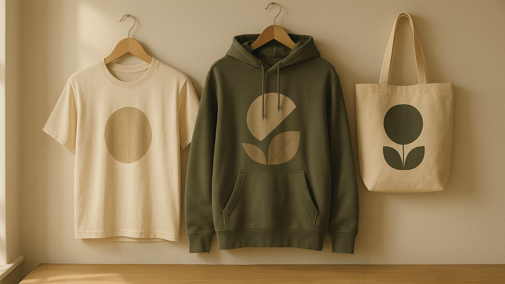
2. Choose backgrounds that enhance your product
Backgrounds aren’t decoration. They’re functional.
They control how visible your product is in the smallest formats.
Good thumbnail backgrounds should be:
-
Clean
-
Uncluttered
-
Contrasting enough to highlight the product
-
Consistent with your brand identity
A neutral background with soft texture works for minimal brands.
A bold block colour works for energetic brands.
What matters is that your merch stands out instantly.
3. Light for the scroll, not the studio
Perfect studio lighting can sometimes flatten your product in small sizes.
Thumbnail lighting should:
-
Define edges
-
Create depth
-
Highlight texture
-
Add micro contrast
Natural daylight or directional soft light often performs best.
It gives shape to merchandise without overwhelming the viewer.
4. Focus on the hero element
Every merch image should have a hero.
In a thumbnail, only the hero survives.
If the image contains:
-
A person
-
A product
-
A pattern
-
A scene
The eye should immediately know where to land.
Position your hero element centrally or in the upper-middle third of the frame. That’s exactly where the thumb pauses when someone scrolls.
5. Stick to recognisable colour palettes
Colour is one of the few elements that survives compression, resizing and cropping. When viewers recognise your colours across multiple thumbnails, you build brand memory.
Use:
-
2 to 3 signature colours
-
Consistent tones
-
High-contrast colour relationships
-
Background colours that complement your merch
Over time, your grid will create a visual language that’s recognisable before someone even reads your name.
6. Use motion strategically
Even static images can feel dynamic when shot with a sense of movement:
-
A hoodie in mid-swing
-
A hand placing a bottle onto a table
-
A tote in motion as someone walks
Movement catches attention, even in a thumbnail, because it creates directional lines.
It signals energy rather than stillness.
Final thoughts: small but mighty
Designing for micro-moments doesn’t limit creativity.
It sharpens it.
When you optimise your merch for tiny screens, you design with intention. You create visuals that cut through noise, that stand out in a grid, and that make viewers pause long enough to click.
In the age of fast feeds and fierce competition, thumbnails are your first impression.
Make them clear.
Make them vibrant.
Make them impossible to miss.